Home

Thursday, March 31, 2011

Nest Mini Scrapbook Album

Good morning all!

Just a quick post today with a sneak peak of the Nest Mini I've been working on. I'm donating this album to a benefit dinner that will raise money for a team walking in a Susan G. Komen 3-Day this summer. One of the team members is a friend of mine from work, and she recently lost her favorite aunt to breast cancer (the funeral was last week). Carla had been battling her cancer (for the 2nd time) for over 4 years. She was one of the strongest people I'd ever met (she worked at our company before she was too sick to work) and never complained about the pain she was in. In fact, she was always looking for some way to help others rather than focusing on herself.

This isn't meant to be a sad post, though Carla's passing is extremely sad. It just that her illness and death was a reminder to me about what's important in life and making each moment count. I started to think about all the things that were important after her funeral, and I realized that THOSE are the things that make up "home" for me. Not necessarily the house where I live (though, it does feel like home), but also the things that make up my life - family, friends, pets, hobbies and memories.

So, the theme of this album is "Nest." Obviously, I won't be filling it with pictures, but I hope the person who purchases or wins it will fill it with all sorts of images of the things that make them feel at home....whether it's a physical building, or all the other pieces of their lives that wrap them up and make them feel secure.

I couldn't wait to share a picture (in fact, I shared this last night on Facebook as soon as I finished the cover), so excuse the cell phone quality, but here it is:


I know you probably can't see all the details, especially since this was taken around midnight, but you get the idea. (And I enlarged the picture as much as possible for the blog so you could see.) I promise there will be better pictures once the album is finished :) The kraft background is just a mailing envelope I had sitting around...I wanted the background a little darker since the cover blended in to my off-white work table.

This is easily the most detailed piece I've made in a long time, but I wanted to go all out on the cover. And now I want to duplicate it and make an album for myself, but I know I don't have time right now! I would definitely buy it back though if it ends up on the Silent Auction they're having. The one thing missing from the cover is a vintage inspired door knob fixture to open the album with...what home isn't complete without a front door?

I'll share more information about the benefit dinner as soon as I have it, since I know my friend would love to see as many people there as possible!

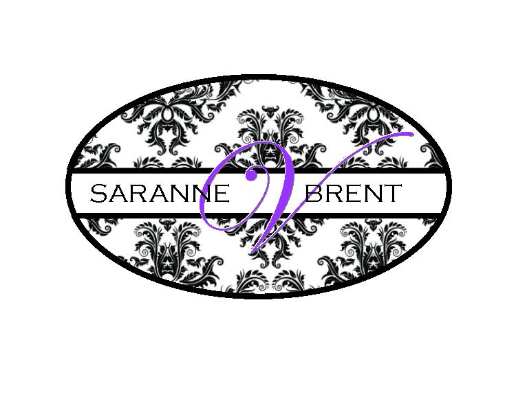
I hope everyone has an excellent Thursday, and upcoming weekend. I don't know that I'll be back before Monday, since life is keeping me so busy! Looking forward to seeing lots of family this weekend at Brent & Saranne's wedding (and I'll also bring back pictures of the finished aisle runner since I forgot to take them before I rolled it up).

Have a great one!

Tuesday, March 29, 2011

General Greeting Cards (It's Finally Over!)

This series of posts features cards I've made for a specific stationery order. My customer requested 25 greeting cards for a variety of occasions. And that's all the direction I got! Knowing her previous purchases from me, she likes simple things and lives on a farm, so I kept that in mind when I was making these cards. She's seen most of the designs I keep on hand for craft shows, so I wanted to create totally new cards for her.

I've tried to divide the cards out into small bunches (rather than overwhelm you with 25 cards and deets in one post) by the occasions they were designed for. Also, I'm a terrible photographer when it comes to cards. This has been confirmed.


Enjoy!

Good morning, all! Well, it's finally here...the end of this series of cards! I want to thank everyone again for all the support I've been given through this series. It's awesome to know that I have people in my corner when it come to this stationery thing :) Now that this series is done, I'm hoping I've found both my blog and creating motivation to keep posting projects on a regular basis. We shall see! I do have a lot of projects in the works for both personal things and for customers, including some wedding invitations, an aisle runner, birthday party invitations, and a scrapbook I will be donating to a fundraising event. I promise to take lots of pictures and share them here!

On to the cards...


This first card I left without a sentiment just because I think the image needs to be the focal point. This card could be used for so many sentiments, I really couldn't narrow it down if I wanted to. My favorite parts are the textured cream cardstock (I rarely use textured cardstock) and the pearl at the center of the flower).


Next up is a card with a color scheme that's really out of my comfort zone, but I wanted to try something different. I love that purple satin ribbon...it's heavy and sturdy. I've been hoarding it for years, and I'm forcing myself to use it occasionally on special projects. The little tag/sentiment image always makes me smile. The first card I ever made Mike (our first Valentine's Day, after we'd only been dating a couple of weeks) had that image repeating as a background. He still has the card sitting in his office. So sweet :)


This card was one of the most time-intensive cards I've made in a long time. Each piece of the background paper is a 1"x1" square, pieced together to look like a quilt. Now...I don't sew, but I still wanted this to have a quilted look, so I drew in my "stitching" around the border. Then I used markers on water-color paper to color in the farm scene. I did the same paper piercing and drawn stitching technique around the focal image. It's definitely a fall-ish card, but since my customer lives on a farm, I couldn't pass up a chance to use this image on a card for her.


And here's another farm image I couldn't pass up! You can pretty much bet that if I find a cute (realistic looking) farm stamp set, I'll be buying it. There aren't too many out there. I used a wheat stamp at the bottom to make a border and add some texture to the base of the card. I also distressed all the layers to give the card a more natural look. This set of 25 cards is definitely the most often I've pulled out my distressing tools!

Well, there ya have it! Thank you again for looking at all the cards I've been creating over the last few weeks. I'm really happy to report that my customer was thrilled with all the cards I gave her, which I was a little nervous about (I like direction when I'm creating custom orders...to have someone say, "Make what you'd like" is a dream, but when it came time to turn them over to her, I had butterflies in my stomach).

Have a great Tuesday, everyone!

Monday, March 28, 2011

Thinking Of You Cards

This series of posts features cards I've made for a specific stationery order. My customer requested 25 greeting cards for a variety of occasions. And that's all the direction I got! Knowing her previous purchases from me, she likes simple things and lives on a farm, so I kept that in mind when I was making these cards. She's seen most of the designs I keep on hand for craft shows, so I wanted to create totally new cards for her.

I've tried to divide the cards out into small bunches (rather than overwhelm you with 25 cards and deets in one post) by the occasions they were designed for. Also, I'm a terrible photographer when it comes to cards. This has been confirmed.

Enjoy!

Good Monday morning, all! How was your weekend? Ours was really great...lots of quality time with friends (who also happen to be our family...which makes us really lucky!) It was a very relaxing weekend, which is just what we needed. Even if everything on our to-do list didn't get done.

So, let's move on to the 2nd to last bunch of cards in this little series I've been doing. Today's cards are all "Thinking of You" cards. These aren't my favorite cards to make, but they are necessary. And it's good to have some of these on hand so I don't have to worry about making a card at the last minute.


First up is a card that I would probably use as a sympathy card, but could also just be used when a friend needs a reminder that you're thinking of them, or doing any tough time in life. Who wouldn't appreciate the sentiment, "You're on my mind"?

I kept this card fairly neutral and simple. The bottom background images (the words) are stamped with a brown distress ink. I didn't really want the words to be read, since I'm pretty sure it's a love story that would have nothing to do with this card. The point is just to see the text. I also roughed up the edges a little bit to give this more of a natural feel, which coordinates with the floral ribbon and stamped flower image.


Next up is a sympathy card. Normally, when I make sympathy cards, they're blue or green. Don't ask me why, but that seems to be my trend. But, I like this melon-y color...it's pretty and soothing. The floral image is stamped on with water color crayons. I colored directly on my rubber stamp and then spritzed it lightly with water, and stamped it onto my cardstock (this probably would have worked even better if I'd gotten out my watercolor paper, but I forgot about it until just now.) I also like the ribbon buckle, which ties in the other brown elements on the card.


This is a general "thinking of you" sort of card. It could be during a time that a friend needs a pick-me-up, but could also be used for happy occasions like a birthday or thank you. I thought the colors were cheerful, which works no matter what the meaning behind the card will end up being.

My process for this card was pretty simple. I stamped the weathered background on the card first, then stamped the dragonflies and embossed them with white embossing powder. Then I sponged on some ink over the top of the dragonflies and the top half of the card. I went back with a dry paper towel and wiped off the ink that was on the embossed images to reveal the white. It's kind of a fun technique that I've done on a few cards now.


The last card for the day is a get well card. I am TERRIBLE at sending these kinds of cards out because I normally don't keep them on hand, and normally, by the time I hear someone is ill and get a card mailed out, they're well again. I wish I was better at it though because the times I've been really sick, getting the mail is a bright moment in the day. It's the little things when you're sick, right?

So, the little piggy is colored in with water colors. Again, I don't break down and color very often, but this little guy was begging for it. I love the background image I used on the bottom of the card (PTI's Background Basics: Retro...that set was getting a lot of miles in this order). And the giant blue button makes me happy as well!

Well, that's it for today, kids. Tomorrow will be the last of these 25 cards...thank you for bearing with me! Hopefully after this little series is complete, I'll have some projects for you that I've been working on lately (no hint as to what they are, because I'm not even done with most of them. Typical me.) Have a great Monday!!

Friday, March 25, 2011

Thank You! (Cards, That Is)

This series of posts features cards I've made for a specific stationery order. My customer requested 25 greeting cards for a variety of occasions. And that's all the direction I got! Knowing her previous purchases from me, she likes simple things and lives on a farm, so I kept that in mind when I was making these cards. She's seen most of the designs I keep on hand for craft shows, so I wanted to create totally new cards for her.

I've tried to divide the cards out into small bunches (rather than overwhelm you with 25 cards and deets in one post) by the occasions they were designed for. Also, I'm a terrible photographer when it comes to cards. This has been confirmed.

Enjoy!

Happy Friday! It's FINALLY here. With snow, unfortunately, but oh well. It's almost the weekend. I thought today's card theme should be "thank you" cards. I've gotten so much positive feedback about my cards, both from seeing them here and on Facebook. Thank you guys so much for being supportive of me and my creative endeavors! It means the world to me. :) Okay...enough sap. On to cards!


First up, probably one of my favorite thank you cards that I've made. It reminds me so much of spring. The label is from a SU! hostess set from a couple years ago and I just love it. I need to use it a lot more. I also really like the pearl accents on the leaf. I have a lot of pearl and rhinestones to use for that sort of thing, but I always hoard them, so I was proud of myself for giving some up. I also distressed the edges on all the layers to keep the card from getting too girly!

Next is a VERY simple number. I love kraft cardstock so much, I wish I could use it on every project. When I added the rope, I started to tie a knot (or bow), like I normally do, and realized that at that point, almost all the cards I'd made had a bow on them. I needed something different, so I just chopped the rope at the edges of the card and frayed them a little.

Here's a fun technique. I stamped my floral and leafy images on a bigger sheet of cardstock, and then cut them in to pieces. It adds something extra to the focal image to have it cut up like that rather than just leaving it as a single sheet. I also like the layered tag a lot...that's one of my favorite looks and punch combos, and I forget about it a lot. This is another one of those cards that has a lot of layers so it's kind of heavy, which I think makes it feel important :)

And the last one, another of my favorites. I broke out the Glimmer Mist on this one for the focal image background. I have all this Glimmer Mist because I love the stuff, and it's on one of my top shelves in my craft room, so I forget to use it! What is wrong with me?? The bow on the card really isn't that green...it's more of a mossy green, so it coordinates a little better than it looks :) I also used one of the PTI vintage buttons on top of the bow, and it's tied with some Divine Twine in the oyster color (grey)...which coordinates with the layer of grey cardstock I used behind my focal image.

So, there you have it. A big THANK YOU to all of you who look at my blog each day! I'll be back on Monday and Tuesday to finish up all these cards (I still have "Thinking of You" and some blank/general ones to show you), and hopefully later in the week will show you some of the projects I work on this weekend.

 I hope everyone has a great weekend!

Thursday, March 24, 2011

Special Celebration Cards

This series of posts features cards I've made for a specific stationery order. My customer requested 25 greeting cards for a variety of occasions. And that's all the direction I got! Knowing her previous purchases from me, she likes simple things and lives on a farm, so I kept that in mind when I was making these cards. She's seen most of the designs I keep on hand for craft shows, so I wanted to create totally new cards for her.

I've tried to divide the cards out into small bunches (rather than overwhelm you with 25 cards and deets in one post) by the occasions they were designed for. Also, I'm a terrible photographer when it comes to cards. This has been confirmed.
Enjoy!

Howdy! It's Thursday, THANK GOODNESS! This week has been so incredibly busy, I'm dying for a weekend.Today's cards are all about special celebrations in your life...weddings, anniversaries, babies. I picked this theme for today because our friend is in labor as I type and we will hopefully get to meet her new little boy soon!


Up first is a wedding card (though this could easily be an anniversary card or a just because I love you card). This has been my go-to wedding card since I first made it. I always think I'll change out the ribbon color to match the wedding colors, but it hasn't happened. The cream (yes, it's cream, not yellow as it looks here) on white is so elegant...I just leave it. And I love it.

The textures were made with Cuttlebug embossing plates. I love the little hat pin detail. This is the kind of card I love to put in a clear envelope because it's just to stinking pretty to hide behind a white envelope!


Next up is an anniversary card. I apologize for the quality of this picture, it's so dark. And I have no idea why, it didn't look this dark on the camera. Anyway...this simple card could be easily replicated (I did make a few of these to have on hand, actually). This is another one that would be fun to change colors on, especially for milestone anniversaries (gold or silver, for example).


This is an extremely simple card that could be used for a baby shower or to send to a mom-to-be to let her know you're thinking of her. I love this silhouette stamp set from SU! and haven't inked it up very often. I need to do that from now on! 


And finally, the first of two baby cards. For both of these cards, I picked unisex colors (green and yellow), but I think they would look equally cute in shades of blue or pink or even purple or red.

I love that stamp from SU!...it makes adorable scalloped labels. And the stamp did all the work for me, I just had to run the green paper through a texture plate. Another card I could duplicate and keep on hand for new babies or baby showers.


Here's the yellow card. When I sat down to make this card, I really didn't know where I was going with any of the stamps I had out. And then this bright little card appeared. I'm loving all the yellow I'm using lately...I guess I need that brightness in my craft life as well as my real life. I am SO ready for spring to be here for real (it's supposed to snow this afternoon, yuck!)

My favorite detail on this card are the two score lines on the bottom part of the card. I think they just add a little something different, and they anchor the sentiment (kind of like a ribbon would do). I know you didn't ask, but my train of thought with the moon and star were nursery rhymes (Twinkle, Twinkle Little Star & Hey Diddle Diddle). I also inked the edge of the card with white ink, which I think softens everything.

Well, there ya have it, day 3 of cards. Are you sick of it yet? :) I hope not! It's not very often that I actually take pictures of my cards (like I should), so I'm enjoying sharing them.

If you missed the first two days, you can find masculine birthday cards here and feminine birthday cards here.

Have a great Thursday, everyone!

Wednesday, March 23, 2011

Feminine Birthday Cards

This series of posts features cards I've made for a specific stationery order. My customer requested 25 greeting cards for a variety of occasions. And that's all the direction I got! Knowing her previous purchases from me, she likes simple things and lives on a farm, so I kept that in mind when I was making these cards. She's seen most of the designs I keep on hand for craft shows, so I wanted to create totally new cards for her.

I've tried to divide the cards out into small bunches (rather than overwhelm you with 25 cards and deets in one post) by the occasions they were designed for. Also, I'm a terrible photographer when it comes to cards. This has been confirmed.
Enjoy!

Keeping with the birthday theme I had going yesterday, I thought I'd just move into the feminine birthday cards. I use the term "feminine" pretty loosely, and in this case, it just means they're meant to be given to women. For the most part, when I make cards for women, I definitely take the opportunity to add glitter, buttons, ribbons and whatever embellies I can come up with. I did sneak one fairly girly card in here though (and my customer loved it, so I was happy!)


This first card is that girly card I was talking about! One of my favorite cards that I've made for any occasion. I'm loving yellow and grey/black combinations in everything right now and had to use it on a card. I need to use it on more cards!

There's a little of everything on here, from the lacy MS border punch to black satin ribbon to hat pins to some bling in the center of the flower and glittered petals. This is the kind of card that I would love to receive for my birthday :) The lacy ruffles are punched from a SU! designer paper that had a very light yellow design on it, which ties everything together nicely. I used the same DSP to make the petals of the flower at the top. Once I'd layered all my ruffles, I used a piercing tool to "lift up" the layers and give them a little more dimension. 


This card was extremely simple to make and really fun for me (because you know how I feel about cupcakes!) I was thinking of a child's birthday when I made this card, but anyone with a sweet tooth would probably love this.

A couple of fun details...I used some rhinestones as the cherries on the cupcake, just to give the card a little more dimension and add in some bling. And for the frosting on the cupcakes, I colored in the image with a Versamark marker, and the sprinkled it with white embossing powder and heated it up. It layers the frosting over the top of the wrappers, just like a real cupcake would have.


This next card could actually be used for both men and women, I think (though, it leans a little more feminine, which is why it's with this bunch). There's a lot of layers in this card, which I love...this thing has some real weight to it. When you hold it, you know you've got something special and handmade.

One fun detail you might not be able to see in the photo involves the blue panels with the white flowers on them. I made my background paper once again by stamping flowers onto my cardstock with Versamark, and then embossed them in white. There's definitely some texture to this card.

On a side note, you can sort of see the inside of the card in this photo and that I included a white panel on the inside. On my darker cards, I like to do that so it's easier to write (because I'm sure that everyone doesn't keep white pens hanging around their house). I rarely stamp messages on the inside of my card unless the stamps I have are meant to be continued; for example, a bold "Happy Birthday" sentiment on the front of the card and a longer verse on the inside. However, if I put a white panel on the inside of the card, I try to draw the overall design into the card as well. On this particular card, I stamped one of the flower images I used from the outside in a corner, in grey. The reason I leave the insides of my cards blank is so they can be personalized for the recipient.


Alright, last one. This is also one of my favorite cards that I've made in a long time because it's so fun and colorful. I've become obsessed with stamps featuring vintage items, like this bike stamp. And there's my yellow, making it's way into a card again. I'm also in love with banners and bunting. This whole card reminds me of a summer day or a trip to the county fair.

To make the banner a little more realistic, I attached the back layer of pennants (blue, green & purple) directly to the card front, and I used dimensional adhesive for the front layer (pink, orange & yellow). And I also love that you can see the little grey tail of the ribbon from the front row of pennants. Next time I make one of these, I'm going to have to break out my grey baker's twine for the ribbon.

Well, that's it for today, kiddies. Stop back tomorrow for another batch of cards. And, if you haven't already, check out my masculine birthday cards here!

Have a great day, all!!

Tuesday, March 22, 2011

Masculine Birthday Cards

This  series of posts features cards I've made for a specific stationery order. My customer requested 25 greeting cards for a variety of occasions. And that's all the direction I got! Knowing her previous purchases from me, she likes simple things and lives on a farm, so I kept that in mind when I was making these cards. She's seen most of the designs I keep on hand for craft shows, so I wanted to create totally new cards for her.

I've tried to divide the cards out into small bunches (rather than overwhelm you with 25 cards and deets in one post) by the occasions they were designed for. Also, I'm a terrible photographer when it comes to cards. This has been confirmed.

Enjoy!

First up, masculine birthday cards. These are always the hardest cards for me to come up with when I'm making batches of cards. First, I like frills and glitter and all things girly. Most guys don't appreciate these things. Second, I rarely (if ever) make cards for the guys in my life...I know they appreciate a good joke rather than a well-made card, so I normally will buy them cards. Yeah, I know, I suck creatively. I've accepted that :)

So, I thought these 4 cards would be the ones I left til last. But, for some reason, when I set my mind to it, these came to me pretty quickly. And I actually like most of them. So, into my design bunch they'll go, and I may actually make cards for some of my guys this year!


The first card is definitely my favorite. I don't pull out my markers and color very often, but this image always makes me want to do that. Now that I look at it though, I think it could really be striking on a kraft background in black or brown ink. Hmm. Regardless, I went for a really weathered, rugged look on this card, and I think I got the message across. I can see this card for someone like my grandpa, who has always worked with his hands and seems to always be working on a project for someone :)


This second card is more of a traditional masculine scheme. There are some guys who you just think of as "classic." This card would be perfect for those types of guys. (I had one of our residents at work in mind when I created this card...it reminds me so much of him.)

A couple of fun things about this card - if you look closely (or enlarge) at the top of the card, you'll see 3 score lines. There's also an oval frame impression around the happy birthday sentiment. I did the score lines with my MS scoring tool...super easy and adds some extra details. The frame I did with a Nestabilities oval, and just placed it under my sentiment and gently ran a brayer over it. Be careful that the paper doesn't tear when you're doing that though. The other fun thing is the ribbon. I didn't have any navy and white ribbon, so I took a piece of SU! white taffeta, a navy marker and a ruler, and made my own. I love the SU! taffeta for coloring on and making custom ribbon.


The third card is definitely the most simple of them all, but I do think this card would work for the majority of guys I know (changing the colors for some). I didn't have paper in the colors I wanted, so I just made some stripey paper using a lined background stamp. I purposely used distress ink so the lines wouldn't be crisp and perfect...I like that they're a little weathered.


Finally, the fourth card is definitely the most fun. I think this would be perfect for a teenage boy, or even someone older or younger. I don't know if you can see in the picture, but the large orange star at the bottom has been stamped with a "rock star" image, and I made sure to distress as many surfaces as I could to give the card a tattered look.

I didn't have a background stamp that I really liked, so I took a circle frame image from a PTI set (Take Note, I think), and stamped the circles on the front of my card. I used an image from Background Basics: Retro to make the smaller circles that are in the spaces of the big circle. It didn't turn out half bad and I'll probably use that design again. I'm finding more and more that I'm making my own background papers rather than looking to purchase just the right one.

You'll also notice that I used ribbon on 3 of the 4 cards. I'm not normally a fan of embellishments on masculine cards, but I think the way I did it here works (they're masculine prints, frayed or a little imperfect, and there isn't a bow in sight.)

Check back over the next few days for other occasions, including feminine birthday cards, special occasions (weddings, babies, etc.), thank yous, thinking over you/sympathy, and general greetings. Not necessarily in that order.

Thursday, March 17, 2011

Happy Green Day!

Good morning all!

If you're a Facebook friend of mine, you've heard me talking about these mint chocolate cake balls I've been working on the last couple of days. If you're not, then you have no idea...so, to catch you up: We somehow got on the topic of cake balls at work the other day, and since I'm always looking for an excuse to bake (because I love to bake, but don't really have a sweet tooth), I said I'd make something for St. Patty's Day. Enter the mint chocolate cake balls.

That's the finished product (FYI, it's extremely difficult to photograph anything in a cellophane bag). I'll write the (very simple) recipe at the bottom, so if you want it, it's yours to have. It's pretty basic.

For the packaging, I just took a cello bag with a self-adhesive strip on top, put in two cake balls, and sealed it closed. Then I used a pad of SU! patterned paper and cut out squares that were 3" x 3.5" inches (3.5" wide...just a little wider than my bag). I scored at 1.5" on the short side. Then I stamped the "Happy St. Patrick's Day" stamp to the left side. I stamped the "pinch proof" label on orange cardstock with Versamark ink, then embossed with gold embossing powder, and punched out the label with a 1.5" punch. The labels were attached to the top right corner, hanging over the side and top when the topper was folded. I just stapled the topper to hold it closed and attach the bag. Pretty simple, it took me less than an hour to make 24 bag toppers (I sent some to Mike's work too).

I hope everyone has a happy (and safe!) day o' green :)

Mint Chocolate Cake Ball Recipe
1 box of chocolate cake mix (and the ingredients you need to make it)
1 can of fudgey frosting
1 package of chocolate almond bark
1 package of Andes brand mint baking chips

Mix cake as directed on package. Fold in 1.5 cups of the baking chips. Bake as directed on the box (I used a smaller pan than I should have, so I had to bake mine a little longer. Just make sure you're testing the cake to make sure it's done before you pull it out of the oven).

Let cake cool completely. Crumble it into a large mixing bowl, and mix together cake and whole can of frosting with a mixer. Cover the bowl and refrigerate for 3 hours or overnight.

Roll your cake/frosting mixture into 1 - 1.5" balls. Place them on a cookie sheet lined with waxed paper. After you've rolled all the balls, put the cookie sheet in the freezer for 1 hour.

Melt the entire package of almond bark in a double boiler. Crush the remaining baking chips in a food processor and stir into the melted chocolate, until melted. (I know a lot of people who use the microwave to melt their almond back...if that works for you, go for it. I just prefer my double boiler). Dip the balls into the chocolate, making sure they are entirely coated. Let remaining chocolate drip from the balls, and place them on waxed paper to harden.

Eat immediately (my vote!) or place in the refrigerator until you serve them.

My cake balls never last, but I would guess they would keep in an air-tight container for a couple of days. Honestly, I don't think you'll have to worry about that unless you're planning ahead :)

Tip: This is the first batch of cake balls I've made without lollipop sticks (which, I suppose, would make them cake pops)...I highly recommend going that route. Dipping them is extremely easy with the sticks in and it's much easier to get a complete coating. You can find lollipop sticks at craft stores (I get mine from Hobby Lobby in the cake decorating section).

Wednesday, March 16, 2011

Apparently

Apparently, March will be the month that I'm absent from the blog.

Apparently, I've taken on too much in my life and there just aren't enough hours in the day!

Apparently, I'm affected by the seasons more than I ever realized, because I've been in a GREAT mood ever since the weather has warmed up.

Apparently, Blogger isn't letting me upload images today. Annoying.

Apparently, eating breakfast before 6am isn't the best idea, because then I'm hungry for something by mid-morning (well, 8:45am, which I guess is mid-morning for me).

Apparently, I've become obsessed with cake balls and plan to finish my mint-chocolate ones tonight for St. Patty's treats tomorrow.

Apparently, Glee is determined to make my heart shine - Kurt and Black Bird last night moved me to tears! Go listen (I don't think the show performance is up yet, but here's the audio.)

Apparently, I'm picking out cakes for events I haven't even determined at this point. I'd show you a picture of the cake I found yesterday, but again, Blogger is annoying.

Apparently, I'm focusing on accessories when dressing rather than the clothes themselves...I've been on a jewelry buying spree for the last couple of weeks (oh, and socks...loving fun socks right now!)

Apparently, I did something wonderful in a past life, and was blessed with an amazing friend in this one - my very best friend, Melissa, is celebrating her birthday today. We've been friends since we were 12 years old and met in Mrs. Plummer's English class. I can't imagine my life without her. Happy birthday, Yissa! We love you :)

Thursday, March 10, 2011

Life Update

Good morning! And happy Thursday everyone :) (One more day til the weekend!!)

I thought I'd quickly update you on what's been going on around here, since apparently I have no spare time to blog. Ugh, I need at least 2 more hours in a day.

- Saranne & Brent picked this monogram for their aisle runner:
Which happens to be the one I wanted to make, so I'm really glad they liked it!

- I'm right in the middle of creating a boxed set of cards for a customer. She asked for 25 assorted cards (birthday, thank you, sympathy, baby, etc.) Because she's seen the stock of cards I have on hand a couple of times (and purchased some), I'm trying to make her completely new designs. Which is a little harder than I anticipated when I took this project on, since I already have about 50 "go-to" designs that I'm working on. Regardless, some really cute cards have come from this, and I'll hopefully get to photograph them this weekend and share here on the blog.

- I'm also attempting to come up with some invitation designs for another customer. "Light green, leafy, and simple" were the directions I was given. I love the freedom, but then realized that I rarely (if ever) use light green on anything, have zero "leafy" images, and try to avoid simple. :) The project is challenging, but I'm sure I can come up with something she'll like. One of the samples I'm going to send her features this image from an invitation set I created awhile ago:

(This is my fav of what I've already done and what I have in my head...so I'm hoping she likes it!)

- This weekend (well, Friday- Monday) is looking to be very busy and a lot of fun. Hopefully I'll remember to bring my camera to some of this stuff and be able to share pictures :)

- It's March 10, and I haven't even looked at my February Project Life photos. I'm terrible. I was much more content in February to just let things happen and see what photos came about. I'm sure I'll have some cute things to put in my layouts, but I need to get moving on them so I don't fall further behind (I haven't even put the January photos in my book yet, even though they were in my hands not long after I posted them in a blog post. Oops.)

- We got the cutest piece of art the other day, I absolutely love it and can't wait to get it in a frame and on the wall. It's called Land of Ampersand, by Katie Daisy - are you familiar with her work? If not, you should be. You can look at her etsy shop, thewheatfield (where I purchased my print) here.
- Work has been insane lately. Challenging (extremely), and rewarding (extremely) all at the same time. There's lots of big projects in the works, and even in the worst of times, I'm still extremely thankful that I work for this company and get to do something I love everyday.

That's about it...work, work, and more work...I guess that sums up my life lately. And lots of puppy cuddles with Miss Molly and sweet Abbygator (who loves to chew on everything - especially Molly's face - which is where she got her Abbygator nickname).

Have a great day!!

Monday, March 07, 2011

More Wedding Monograms

Happy Monday all!

No, I didn't fall off the face of the Earth. Just been extremely busy with all sorts of projects I've taken on. One of which is making wedding monograms to be used on an aisle runner for a wedding in April. Here's what I came up with for the bride, just for starters:


Hopefully she likes one of these!!

(By the way, I'm still selling monogrammed aisle runners. You can read my original post about aisle runners here. If you're interested in working with me - or know someone who might be - have them contact me at vogtdesignco@gmail.com and I'd be happy to work with them!)